
Every year, thousands of new products go out onto the market. With the ever-expanding selection of goods, companies need to ensure their product stands out among a sea of similar merchandise. One way to achieve this to have a fresh and unique packaging design. This means using the product packaging to boost sales.
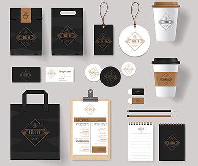
Packaging Design Basics
The main purpose of packaging is to protect a product from being damaged during transportation. It also ensures easy handling and greater portability of the product. For example, bulk packaging apples in cartons of six means the apples can be displayed in a neat stack instead of a messy pile, and it reduces spoilage due to bruising. And having tightly sealed containers for liquids is crucial to ensure drinks stay fresh and don’t leak.
Another vital role of packaging is to attract consumers to pay attention to the product. Details such as color schemes, font types, and packaging illustrations are all crucial factors to consider. Packaging materials, including packaging glue, are also significant considerations when creating a design. These features help differentiate a brand and make it stand out.
Dieline Awards

Many international design competitions exist to identify fresh and innovative packaging designs. The Dieline Awards is one such annual global competition to find the world’s best consumer packaging design.
Established in 2007, the Dieline aims to bring awareness to the value of well-designed packaging. It created a platform where a community of designers can be exposed to new projects and stay on top of trends.
Dieline works under the belief that impeccable packaging plays a direct role in the success of a product or a brand. Its founder, Andrew Gibbs, believes unique packaging designs can transform an ordinary product into a must-buy item. Currently, it is the most visited packaging design website in the world.
Award Winning Designs
 Every year, hundreds of packaging designs are submitted to compete in the Dieline Awards. This prestigious design competition celebrates innovation and honors the hard work of designers.
Composed of a jury of experts in structural packaging, design, branding, and consumer products, each submission is examined for creativity, marketability, innovation, and execution. Dieline organizes the designs by packaging substrate, ranging from aluminum and glass to paper and plastic. It also lists designs by categories, such as beverage and toys & games.
One winner is awarded the Dieline Awards Trophy under each category called the Best of Show Award. A second and third place winner for each category is also selected and recognized. The grand prize winner of the entire competition is selected based on the highest cumulative score among all entries.
Below are some of the most notable Dieline Award winners who leave us all wondering, “why didn’t I think of that?”
Tapped Birch Tree Water
This award-winning design by U.K. design firm Horse won the 2016 Dieline Award for Best of Show. A quick glance at the packaging and one can appreciate its simplicity and ingenuity.
Birch tree water is the birch sap that comes from tapping birch trees. It is a traditional springtime drink in Finland and is a popular source of detox throughout Scandinavia and Eastern Europe because it is full of vital minerals, vitamins, and antioxidants.
Since the beverage is relatively unheard of in the U.K., the brand had to educate consumers about birch water before marketing it to the British population. They recognized that clarity of product communication is the most important aspect, and decided to translate this into the product packaging.
The packaging designers used a cylindrical can made of paperboard. They painted faint brown lines randomly across the silver-colored cylindrical can to mimic the look of birch tree bark.
Not only did this unique, eye-catching design help distinguish the product from other beverages on the market, it also played a role in saving the environment. The can is made from 75% recyclable wood and other renewable paperboard from sustainably managed forests. The can allows for the drink to be stored at room temperatures, further decreasing its carbon footprint compared to beverages that require refrigeration.
Paper Water Bottle
The paper water bottle design won the 2016 Dieline Sustainability Awards.
The Paper Water Bottle is the first water bottle in the world to be made of paper. Inspired by creator Jim Warner’s son, who blurted out “You make trash?” when he found out his dad designed bottles and packaging for his job. It offers an eco-friendly alternative to the traditional plastic water bottles.
Constructed of pulp shell which is a combination of plant-based fibers such as bagasse and bulrush, the entire Paper Water Bottle from the closure to the label is compostable and biodegradable. It is helping reduce the number of 80 billion plastic water bottles being produced annually. It also addresses the problem of plastic water bottles in landfills and oceans which can take around 800 years to biodegrade.
T2 Tea Mini Fruits
This unique fruit packaging design won first place in the 2017 Dieline Awards Limited Edition Category. It was conceived as part of T2’s 2016 Christmas campaign.
T2 is a tea shop based in Australia. Established in 1996, its stores feature a casual, fun vibe, with Chinese newspaper covering the walls, a pink ceiling, and towering tea displays. The shop makes their own tea blends and introduced wholesale tea in 2002. The T2 Mini Fruits packaging for bulk teas stayed true to the brand’s fun and colorful vibe.
Waterdrop Microdrink
Austrian water company Kvell enlisted the help of Dutch design firm PaperFoam to create a unique design for its product, Waterdrop. The innovative packaging won the 2017 Dieline Sustainable Awards.
The Waterdrop is the world’s first microdrink, which is a compressed cube of essential vitamins and superfood extracts to enhance your water and your health. Designed to get people to consume more water the Waterdrops are available in four flavors; Focus, Youth, Boost, and Defense. Each flavor contains different ingredients and offers numerous benefits such as boosting mental power or giving you a healthy glowing complexion.
The designers constructed the box with a 100% biodegradable material that houses 48 microdrinks. Each waterdrop cube is individually wrapped and housed in its own square box to keep it sanitary before consumption. As if the concept wasn’t motivator enough, the attractive eco-friendly packaging is sure to get folks drinking more water.
Artist Invitation for Damien Hirst
Designed by student Jiwon Chong at the New York School of visual arts, this creative opening night invitation for artist Damien Hirst won second place at the 2017 Dieline Awards. Its innovative form is one of the highlights of every exhibition visitor.
Damien Hirst is an internationally renowned English artist who rose to prominence in the 1990s. His works feature a common theme of death and medicine. Jiwon Chong decided to honor this idea by remaking Hirst’s signature works into tiny pills inside a medicine package.
To obtain more information about the upcoming event, one would simply pop out the uniquely shaped pills from their packet. This relevant and unique invitation provides invitees with the special experience of interacting with a piece of Hirst’s work before they attend his exhibition.
Marais Piano Cake
This packaging for cake is designed to look like a piano and is meant to be given away as a gift. After all, who wouldn’t want to be seen carrying a cute little ‘piano’ to a party and handing it over to the host?
Designed by Kazuaki Karahara of Japan, this design won second place at the 2017 Dieline Awards. The cakes in this packaging design are wrapped individually and meant to be easily carried away and shared. The design uses all six surfaces of the square, and creates pianos in a variety of sizes, from the smallest keyboards to a full 88-key grand piano.
The designers achieved the look of a piano by making the outer box approximately 10mm lower than the individual cake packages. Every single package is also shaped like a square and have not been fixed in place by fugitive glue. This means they can be easily rotated to display different keyboard patterns so one can truly personalize the look of their piano.
Domino Effect
Domino’s Pizza has become the second-largest franchised pizza chain in the world. Over the years, it had used boring pizza packaging that didn’t resonate with consumers. The U.K. design firm, Jones Knowles Ritchie, aimed to rebrand Domino’s Pizza in the U.K. by making a splash with brand-new packaging.
While conducting research Jones Knowles Ritchie found that 96% of all Domino’s pizzas are sold in pairs. They decided to use this in their quest to bring Domino’s iconic logo to life. The resulting design was two brightly colored pizza boxes, one red, one blue. Furthermore, they added solid white dots onto the lid of the boxes, one dot on the red box and two dots on the blue to resemble Domino’s logo.
The new minimalist design also features short sentences running across the sides of the boxes, with statements like ‘fresh dough daily’ and ‘only 100% mozzarella’. This contrasts with the old packaging where paragraphs of generic information written in tiny fonts had been squished onto the packaging design. The new designs make Domino’s brand charismatic and memorable.
The finishing touch was making the packaging 100% recyclable to lessen the environmental impact. High-quality ink has been used to print the red and blue to ensure the pizza’s heat won’t affect the colors of the box. The design earned a second place at the 2017 Dieline Awards.
Hinoki
This design by the Swedish design firm Nine won the 2017 Dieline Awards for the Best of Show. This means it was the highest rated project out of all the contests entered in the competition.
The packaging design is made for a range of travel-sized organic skincare products. The designers wanted to create sustainable packaging to show respect to the planet. They also drew their inspiration from origami. As a result, the final design is made from biodegradable paper with a tear-off corner. Each container uses a single piece of laminate paper. Once the corner has been torn off, a Hinoki wood twist cap is revealed, which seals the product to keep it fresh.
Utopic Chocolates
Utopic Chocolates is a master chocolatier constantly searching for new flavors, textures, and filling techniques. The company wanted a unique packaging design for its new product, Utopick. Spanish design firm Lavernia & Cienfuegos helped create new packaging to reflect Utopic’s constant invention and creativity in chocolate-making.
Utopick is a play on words for “you to pick.” It is also a reflection of the chocolatier’s constant thirst for unattainable perfection. The packaging designers came up with the idea of a plain white chocolate bar, with two triangles on the top right of each bar.
The two triangles are unique in terms of shape, color, and print pattern. This personalizes each bar of chocolate for a unique consumer experience. Furthermore, when four bars are put together in a pinwheel shape, a square is formed at the center to reflect the Utopick symbol. This design won Lavernia & Cienfuego third place in the 2017 Dieline Awards.
The Underground Project Wines
Australian design firm Co Partnership was tasked with creating a packaging design for Hungerford Hill’s sub-brand of wines, with the aim to appeal to a younger demographic.
Most Hungerford Hill products are designed with traditional super premium values that appeal to an older demographic. So, Hungerford Hill created a sub-brand of wines that will stand out to younger consumers with the aim of increasing online sales.
The final design strayed away from having a traditional wine label. Instead, it focused on simplicity and minimalism. This is achieved by covering extra words with a solid black box, leaving the heart of the message on display. As a result, simple phrases such as ‘juicy’ and ‘balanced’ standout amongst a sea of solid black boxes, earning the designers a first place in the 2017 Dieline Awards.